
 像素鱼丸
像素鱼丸
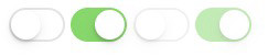
网上看过很多 Switch 的例子,很多还需要额外的 label 或者 i 标签配合来实现,看到有个完全使用 CSS3 来实现的例子。只使用 CSS3 的伪类就可以实现。
HTML:
<input type="checkbox" class="switch">
<input type="checkbox" class="switch" checked>
<input type="checkbox" class="switch" disabled>
<input type="checkbox" class="switch" checked disabled>
CSS
.switch {
  box-sizing: border-box;
  appearance: none;
  user-select: none;
  height: 31px;
  width: 51px;
  position: relative;
  border-radius: 16px;
  cursor: pointer;
  outline: 0;
  z-index: 0;
  margin: 0;
  padding: 0;
  border: none;
  background-color: #e5e5e5;
  transition-duration: 600ms;
  transition-timing-function: ease-in-out;
}
.switch::before {
  box-sizing: border-box;
  height: 27px;
  width: 47px;
  content: ' ';
  position: absolute;
  left: 2px;
  top: 2px;
  background-color: #ffffff;
  border-radius: 16px;
  z-index: 1;
  transition-duration: 300ms;
  transform: scale(1)
}
.switch::after {
  box-sizing: border-box;
  height: 27px;
  width: 27px;
  content: ' ';
  position: absolute;
  border-radius: 27px;
  background: #ffffff;
  z-index: 2;
  top: 2px;
  left: 2px;
  box-shadow: 0px 0px 1px 0px rgba(0, 0, 0, 0.25),
              0px 4px 11px 0px rgba(0, 0, 0, 0.08),
              -1px 3px 3px 0px rgba(0, 0, 0, 0.14);
  transition: transform 300ms, width 280ms;
  transform: translate3d(0, 0, 0);
  transition-timing-function: cubic-bezier(0.42, 0.8, 0.58, 1.2);
}
.switch:checked {
  background-color: #4CD964;
  background-image: -webkit-linear-gradient(-90deg, #4CD964 0%, #4dd865 100%);
  background-image: linear-gradient(-180deg,#4CD964 0%, #4dd865 100%);
}
.switch:checked::after {
  transform: translate3d(16px, 0, 0);
  right: 18px;
  left: inherit;
}
.switch:active::after {
  width: 35px;
}
.switch:checked::before,
.switch:active::before {
  transform: scale(0);
}
.switch:disabled {
  opacity: 0.5;
  cursor: default;
  transition: none;
}
.switch:disabled:active::before,
.switch:disabled:active::after,
.switch:disabled:checked:active::before,
.switch:disabled:checked::before {
  width: 27px;
  transition: none;
}
.switch:disabled:active::before {
  height: 27px;
  width: 41px;
  transform: translate3d(6px, 0, 0);
}
.switch:disabled:checked:active::before {
  height: 27px;
  width: 27px;
  transform: scale(0);
}
声明:本站所有文章和图片,如无特殊说明,均为原创发布,转载请注明出处。